Packaging
Firey Flavor is a spice brand based in Rockland, Maine. It is positioned as an elevated take on classic spices, highlighting natural, high-quality ingredients.
I was tasked with creating a compelling and memorable packaging system for Firey Flavor’s line of spices. The project aimed to establish a distinct visual identity that reflects the brand’s edgy, bold, and playful character, while ensuring the packaging is practical, accessible, and visually engaging.
Client:
Firey Flavor
Year:
2022
-
Firey Flavor is an edgy, bold, and playful brand that invites consumers to embrace creativity and excitement in their cooking.
Firey Flavor aims to transform everyday cooking into an adventurous, enjoyable experience for customers of all ages, backgrounds, and culinary skill levels.
-
TARGET AUDIENCE:
Families with young children, Gen X, and Gen Z consumers who are passionate about cooking with quality productsPROJECT NEEDS:
Flavor cues, engaging, bold, brevity, highly legible -
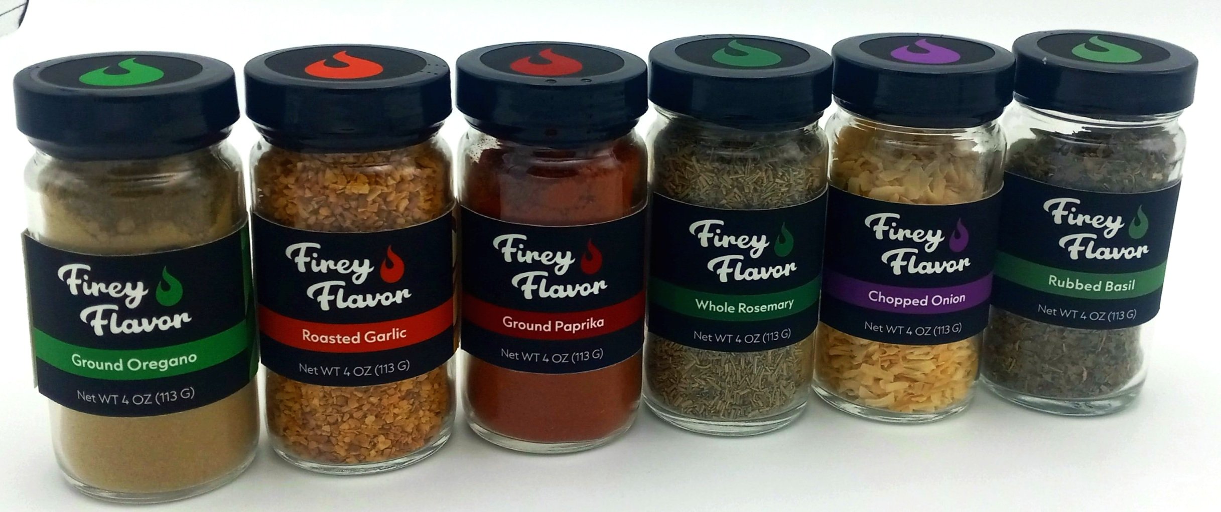
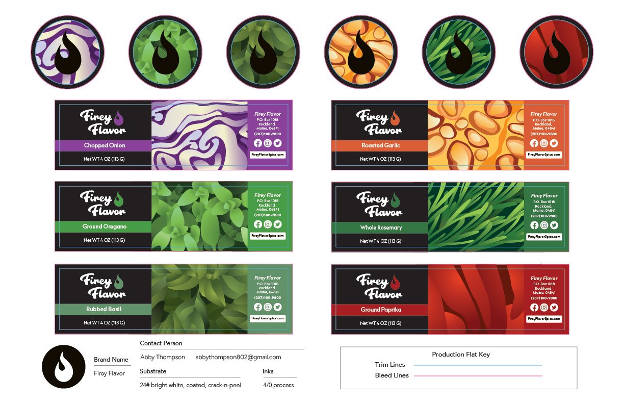
My goal was to design spice labels that attract attention on retail shelves and make cooking more enjoyable and approachable for a diverse audience.
To meet this need, I strayed from the static style of spice labels to lean into illustrative content that reflects fresh products of the individual spices.
-
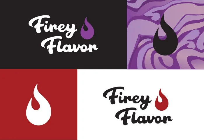
The design choices for the spice labels were guided by the need to convey bold flavor cues visually, ensure vibrancy, and foster engagement.
Every aspect, from typography to color palette and label layout (with the split written content), was intentionally used to reflect the brand’s playful and edgy personality.
The labels are designed for instant recognition and accessibility, emphasizing readability and visual appeal. This approach ensures that the packaging attracts attention and enhances the user’s overall cooking experience.