Packaging
Pop Drop is a modern, health-based snack brand focused on providing tasty and healthy snacking options.
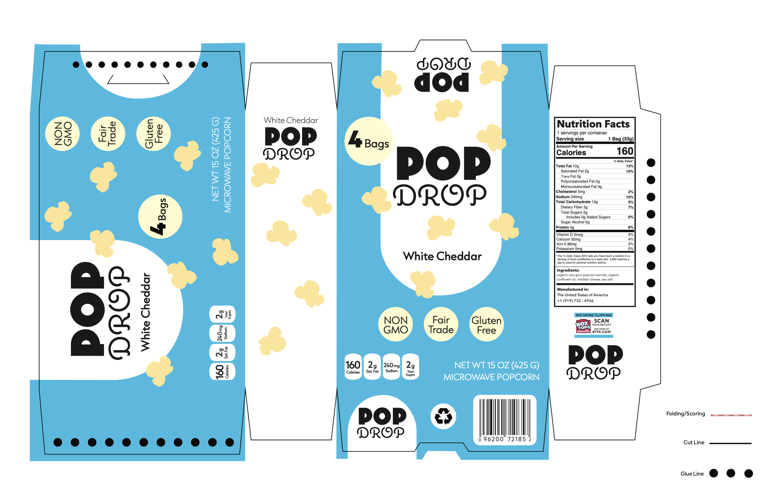
I was tasked with creating a visual identity and applying it to custom packaging for three different Pop Drop microwave popcorn box flavors.
Client:
Pop Drop
Year:
2022
-
Pop Drop is a health-forward, quirky, and friendly brand dedicated to providing nutritious and delicious snacks for busy college students and young professionals.
Their products emphasize accessibility and convenience without compromising flavor or quality. Pop Drop encourages balanced snacking through playful branding and approachable design, making healthy choices feel fun, effortless, and satisfying. -
TARGET AUDIENCE:
Gen A, Gen Z, Gen X, Families with young children
Brevity, sans serif, reflection of values and interests, colorfulPROJECT NEEDS:
Striking, highly legible, flavor cues, engaging -
The design strategy focused on appealing to the target audience of consumers seeking healthier snack alternatives without sacrificing fun or flavor. The visual approach emphasizes subtle communication using clean layouts, vibrant but balanced color palettes, and modern typography to convey freshness and transparency.
The wordmark logo features a playful weight contrast, creating visual interest while maintaining an approachable, contemporary feel.
This strategy positions the brand as health-conscious and relatable, aligning with the target audience’s values of authenticity, wellness, and mindful indulgence.
-
I evolved the packaging design through an exploration of form, color, and composition to reflect the brand’s playful yet health-conscious identity.
The rounded shapes and bold typography create an approachable energy, and the modern color palette differentiates each flavor to enhance shelf visibility.